
Being is a small home it is so important to me that my wall colors flow nicely from room to room without being lame and boring.
My house, before the new Martha Stewart paint hit shelves at Home Depot, was painted in Benjamin Moore colors. I loved all my BM colors, but they didn't flow very well because I had picked colors that lacked similar undertones.
Because there are so many others out there just like me that find it hard to see undertones and find colors that flow and compliment each other perfectly, Martha has come up with the best paint guide ever! She has 6 (apple, moon, star, sun, leaf, and flower) different symbols, each paint color has a symbol. If you stay within your symbol group, your paint colors will compliment each other and flow amazingly!
 I love the little sample sized paint colors. I have bought so many! They are not only great to test out on a wall you are wanting to paint, but are also perfect for a small projects that only require a small amount of paint.
 Seriously! Look at all the amazing colors! All of the Martha Stewart paint colors with their symbols are in this great brochure that you can pick up at Home Depot.

These are some of the colors that I have is my house so far. It was hard to decide but I went with the flower symbol. I love these colors! The green and blue I decided to get mixed half strength, and the pink just one quarter strength...I tend to like really soft colors or very intense dark colors.
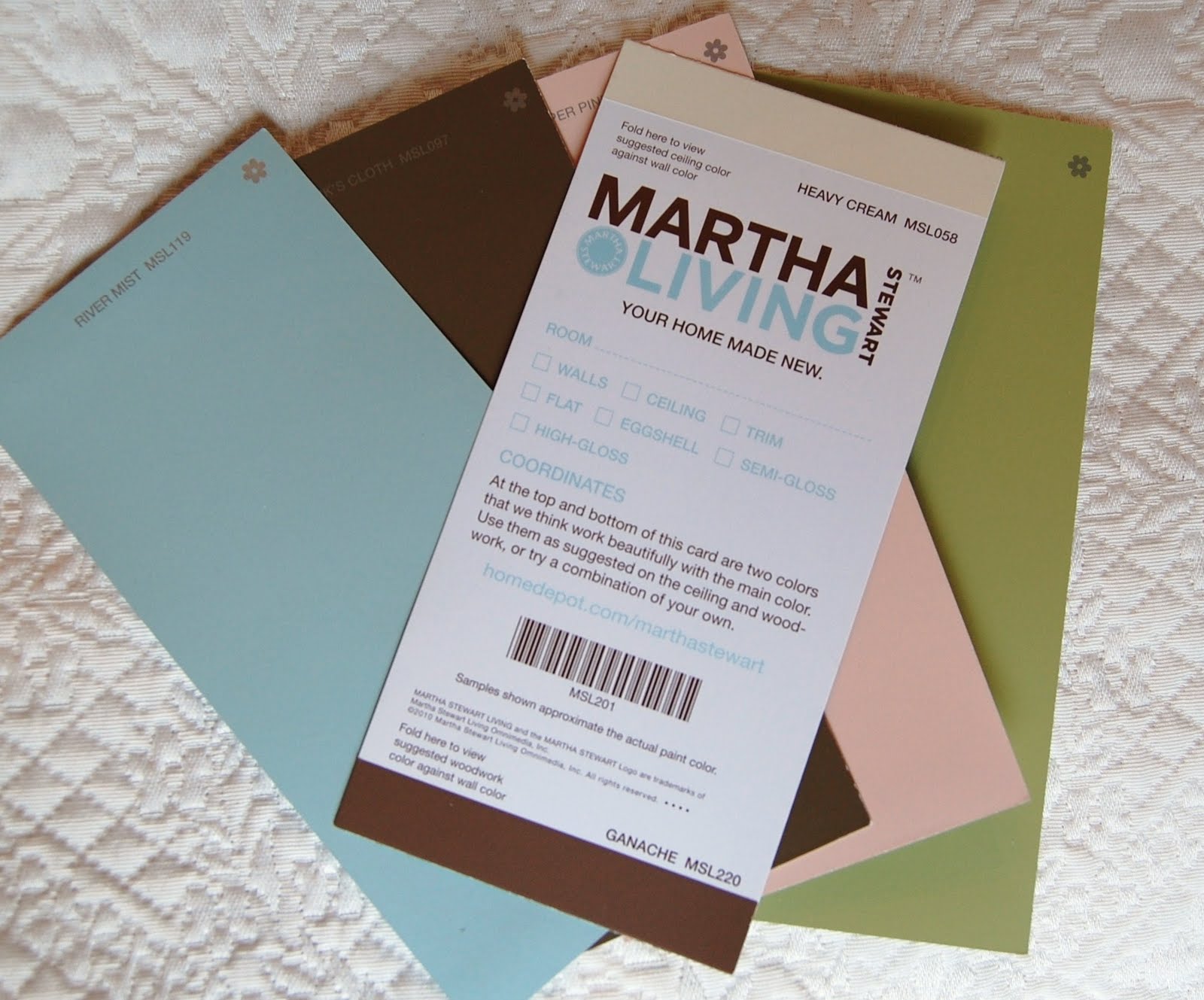 Another great thing about these color cards... there are suggested colors for you ceiling and trim work listed on the back of each card.
 Last time I went to Home Depot, I noticed that Martha has recently put out a line of faux finishes...also symbol coordinated colors!
I am linking this post up with...
The Shabby Nest, Frugal Friday
Finding Fabulous, Frugalicious Friday
Chic on a Shoestring, Flaunt it Friday
&
At The Picket Fence, Inspiration Friday
Click on the links in my "Favorite Places to Link" page to check it out.
At The Picket Fence, Inspiration Friday
Click on the links in my "Favorite Places to Link" page to check it out.
I am so with you on the Martha paint line. I love the colors and the way the are designed to flow together. I just painted swatches on poster board to pick a LR color. Don't get me started on the sample sizes! They are a much better value than craft store paint. I've got my eye on the silver faux finish for some furniture projects. Gotta love Martha.
ReplyDeleteThanks for the review. We usually shop at Lowes (no Martha Stuart colors there) but we may have to convert to Home Depot shoppers now :)
ReplyDeleteThat is a really great idea. I'm so glad you shared!
ReplyDeleteAwesome! This is exactly what I need!
ReplyDeleteGirl! I discovered Martha's paint guide a few weeks ago myself! LOVE it!! I keep one at home and one in my purse for when I'm out shopping. So convenient to have every single color in her line in one place. As somebody else commented above, I'm a Lowes girl myself but Hubby likes Home Depot so he dragged me in there one day. Soooo glad he did!! :)
ReplyDeleteThanks for the sweet comment on my bathroom project and for being my newest follower! Your blog is awesome and I'm now following it as well.
Xoxo
Jenny
I have to check this out. I didn't know about this but I love how it's easier to make them flow. I always struggle with that.
ReplyDeleteI'm a Benjamin Moore girl myself, but I did just order one of Martha's Corian design for a new master bath vanity counter.
ReplyDeleteI'm with you on paint samples - I love them too! I have several fan decks from the big paint companies. I think I'll have to pick up Martha's now!
ReplyDeleteThat is really cool!
ReplyDeleteHi Emily! Oh, that Martha! She is always coming up with the best ideas. :-) That really is quite clever with the symbols and I'm going to have to make sure to follow that next time we paint (which hopefully won't be for a long time)! Thank you so much for linking up these great tips to Inspiration Friday this week!
ReplyDeleteVanessa
I love Martha's colors. When I was looking for the perfect periwinkle for my front door...I went to Martha. Her Bluebird was just the color I was looking for. I have the color chart you are referencing and you are right it is so easy to pick out color coordinated colors going by her coding system. Love it.
ReplyDeleteYou need to redo my home.
ReplyDelete